A Beachcomber in the Orient is a fantastic travelogue from 1923 that deserved a new life and a great design. The editions available before the Island Trader publication were either almost 100 years old, or poorly made modern reprints with typos, missing images and unattractive cover designs. So we gave the book a complete facelift.
Client: Island Trader
Project: Print book, ebook, and cover design, as well as an updated map for a classic travelogue.
Date: May 2019
Cover design: The book got a new cover that imitates the style of vintage travel posters. The story takes place in Asia in the 1920’s, spanning multiple countries and settings, from posh hotels to the depths of the jungle. So the cover image sports a jungle foreground and a Chinese junk. The typefaces also enforce the 20’s vibe of the book, and are easy to read even at thumbnail size.
Interior design: The interior was refreshed too, and the text got annotations and a preface. The typeface used was Garamond, which is an easy-to-read font of timeless elegance, combined with Gill Sans for the contrasting, classic headers.
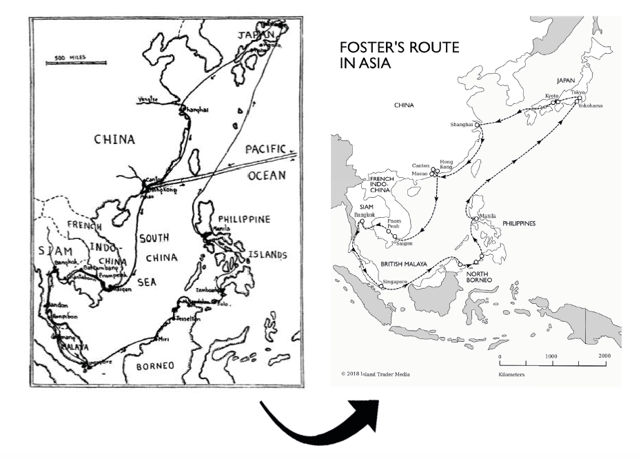
Illustrations and original images: I redesigned the original hand-drawn map that shows the author’s route, but the new map still retains a classic style that fits the era of the story. The original images were carefully scanned, optimised, and captioned.
Ebook conversion: I converted the book into digital files and thoroughly tested it on a variety of devices. The glossary in the ebook has interactive pop-up notes. The ebook version includes all the images and illustrations, to which I added metadata to make the book fully accessible.
Check out A Beachcomber in the Orient – Annotated Edition on Amazon:
https://www.amazon.com/Beachcomber-Orient-Annotated-Harry-Foster/dp/1916403301/
Return to the portfolio page, or get in touch – I’d love to work on your book next!
- All
- Print book
- Cover design
- Illustrations
- Ebook